Monday, December 21, 2009
"Ataque de Panico!"
It's not a Dicken's Christmas tale, but here's a story that I really love to hear.
Apparently a producer in Uruguay created a 4 minute short of a robot attack on Uruguay's capital called "Ataque de Panico!". The Playlist stated that the director may be the next Neill Blomkamp, who made the South African-based alien flick "District 9." With the blog abuzz, the South American short went viral, and has already been viewed on YouTube 1.5 million times.
Well, apparently nothing gets by Hollywood these days. The lucky duck told the BBC, "I uploaded 'Ataque de Panico!' on a Thursday and on Monday my inbox was totally full of emails from Hollywood studios." Long story short, a bidding war ensued. The offer he pocketed: A $30 million deal with Sam "Spiderman" Raimi's Ghost House Pictures. That's a nice return on investment.
This a perfect example of what happens when you put it out there. Got hit single, screenplay, art installation, cupcake recipe rolling around inside dying to get out? Well, Fede Alvarez had a dream and he is now about to see what happens when you put a plan into action.
Monday, December 14, 2009
iPhonetastic!
One the reasons I love Apple so much is because they make products that allow everyone the opportunity to express themselves artistically. A prime example of this is the myriad of photography apps available that allow you to manipulate and alter images taken by your camera. My latest favorite is the imimux iPhone application, TiltShift. It allows you to transform any scene into a miniature world. This application simulates a tilt-shift lens that tricks your mind into viewing a photo as a miniature scene like a model railroad for example. Here are some that I shot recently here in SoCal. I really love using the app ($2 bucks!) and am always looking for an opportunity to use it. (And no, I was not paid by Apple to post this...)
Thursday, December 3, 2009
It's a Jean-Charles de Castelbajac’s Xmas!
I really wanted to post something beautiful so, this is it.
To bring Christmas Cheer to Paris, 2 well known Parisian retail facades will be dressed-up for the holidays by non other than Jean-Charles de Castelbajac this month to visually stimulate and excite Parisian shoppers. At the second-oldest department store in Paris, Bazaar de l'Hotel de Ville, or better known as the BHV, a dynamically neon-lit facade will be lit up on November 17, blasting powerful vocals performed by the 28-year-old, Arkansas-born Beth Ditto of the group Gossip.
Jean-Charles de Castelbajac’s the other Holiday installation is at the top of Champs Elysée, at Publicis Drugstore, established in 1958 and located on the site of the famed Astoria Hotel. The complex now houses two restaurants and several specialty shops, including a high-end grocery store. From November 20 to January 20, the building will be covered with gigantic colour glass panels and the inside will have a similar color-rich treatment with the theme “Pop your X-mas”. I'm a big fan of having renown artists to manipulate and enhance our surroundings and I doubly love the fact that there isn't a gigantic logo hovering above the installation. Joyeux Noël!
Monday, November 30, 2009
Aol. Lol?
AOL recently revealed it's brand new logo as it separates from parent company Time Warner, on December 10th, and becomes a wholly new and independent entity. The new mark was created by Wolff Olins, who have been on a tremendous tear as of late for creating identities that have design blogs everywhere incensed and confused as to how some of these identities ever see the light of day.
The new mark is no longer uppercase “AOL” now it’s title case “Aol.” with a period. This new mark is suppose to communicate a solid departure from it's corporate parent and is now committed to position itself as a solid player in creating a platform for a content-driven organization. The AOL press release states:
AOL today previewed its new brand identity for its future as an independent company committed to creating the world’s most simple and stimulating content and online experiences.
The new AOL brand identity is a simple, confident logotype, revealed by ever-changing images. It’s one consistent logo with countless ways to reveal. The new brand identity will be fully unveiled on December 10, when AOL common stock begins trading on the New York Stock Exchange.
“Our new identity is uniquely dynamic. Our business is focused on creating world-class experiences for consumers and AOL is centered on creative and talented people — employees, partners, and advertisers. We have a clear strategy that we are passionate about and we plan on standing behind the AOL brand as we take the company into the next decade,” said Tim Armstrong, Chairman and Chief Executive Officer of AOL.
Currently, here seems to be a lot of haters regarding this new mark and the consensus seems to be quite negative.
My take on this new logo? I like it. It's clean, simple and going away from it's corporate roots and aligning itself visually with the newly structured company's new promise of being content-driven. I don't mind the font or the period as it's a nice base for Aol.Personals, Aol.Autos, Aol.Classifieds etc. It also makes a solid statement with the period as Aol. being the definitive online destination and one of the first players as a global internet provider. The graphic elements floating behind the Aol. logotype are interesting - a simple and engaging visual cue as to what we can expect from this new company. Nice going, Wolff Olins.
Monday, November 23, 2009
Tasty Tomato
I love typography especially when it's handled well. Tomato out of the UK has a firm grasp on how type can enhance, engage and most importantly communicate. More than just mere words just lying there listlessly, Tomato's type executions are sophisticated and smart. Case in point, their latest project for Smirnoff is a beautiful black and white on-air execution with typography actually floating and interacting with the product to tell the story. Nicely done.
Saturday, November 21, 2009
James Jean
Once upon a time, I used to think I was a pretty good at drawing until I came across another talented artist with a really cool name, James Jean. His subject matter tends to be dark and dreamlike with an almost children's book style that really shows off his enviable draftsmanship. It's all amazing, but I think my favorite stuff is his sketchbook work.
Best Commercial of the Decade
Adweek is collecting votes for Best of The Decade regarding all things advertising. You can vote for a myriad of categories such as: Best Agency, Best Production Studio, Best Promotion, Best Brand etc. etc. There is a large range of print, outdoor and commercial selections to entertain and delight. My vote for "Best Non-Super Bowl Ad of the Decade" is split between Goodby's Comcast Rabbit and Honda Grrr (Wieden + Kennedy) as I am sucker for clever writing, brilliant visuals and rabbits. Cast your vote now!
Wednesday, November 11, 2009
Fresh Cherry
Thought I'd post something from my latest online portfolio for Dr Pepper Cherry that I thought turned out rather well. Now with more explosive Cherry visual impact and taste! Dig it.
Sunday, November 8, 2009
chipsheean.com
It has come to my attention that designing and producing your own portfolio site is very similar to giving birth (though I am sure my wife would have a few words on the subject...). After many years of never having a spare moment to do my own site, I finally found both the time and the determination needed to get it completed. The hardest part was sifting through all the hard drives, collecting the work and trying to construct a thread or feel that told my story. Additionally, writing the copy, shooting the pieces, trying to figure out the proper canvas from which to project the work and the right navigation - it all takes time. When it came to the About page, I knew that I did not want to have a photo or one particular piece from the book tell the story - so, I decided to take something from my sketchbook which is a common exercise for me and depict it in a pictogram. A collective of images and symbols that quickly described myself quickly. Clever? No. Easy? Yes.
All and all, I'm pretty happy with the result and I've gotten a lot positive feedback and some possible projects as a result.
Thursday, November 5, 2009
Jim Carrey
I recently discovered a new site devoted to all things related to the highly entertaining (and possibly disturbing) comic Jim Carrey. The site seems to have been heavily directed by Jim and incorporates all of his various film characters and personas that he has portrayed over the years. What I love about the site is that it is a content-rich, insane joyride through the world of Jim Carrey. With graphic elements and links that seems to go from one rabbit hole after another, It's as if someone peeled back top of Jim Carrey's head and poured the contents into the internet. A perfect vehicle for the entertainer and raises the bar as an authentic interactive experience.
Friday, October 23, 2009
Open Happiness
Coca Cola is launching a new social media push by sending 3 bloggers worldwide to uncover what makes people happy. The bloggers are chosen by the highest amount of votes the team receives from Coke’s “Open Happiness” campaign website. Starting January 1st, the lucky bloggers will hop from country to country hunting bliss, while Coke pays their salary and expenses. The travelers will meet with locals, attend internationally-renowned events like the Winter Olympics in Vancouver, and ultimately blog about it. Wish I could take a year off and do this myself - sounds like a blast.
In an era marked by a tough economy and a spirit lacking in the optimism department, this is a great way for Coca Cola to "walk it and blog it" and hopefully shed some light as to what it is that truly puts a smile on our face.
Wednesday, October 14, 2009
Go Fatoe Go!
Fatoe is the portfolio site of the ridiculously talented Mike Orduna. He has been on my radar for some time now and I typically have something of his pinned up on my style board when I need to convey a cool, hip street vibe. His illustration work is fantastic and has a loose gestural energy to it that looks as though it's an animated piece that's ready to lift off of the page and magically render right before your eyes. Additionally, it looks like he has been quite busy as an interactive art director. A double threat and no doubt a very busy creative. Check it out!
Tuesday, October 13, 2009
Union Bank's new identity
Recently received a message from the president of Union Bank announcing the launch of their new logomark. In a letter issued to customers last month, Union Bank President and CEO Masa Tanaka explained:
“With the change in our name, it was necessary to update our logo, and this gave us a wonderful opportunity to develop a look that underscored the values that we hold close.”
“The most important among these values is a singular dedication to serving your financial needs, which we have very boldly illustrated by adopting a dominant U in our new look. We hope you will always consider it your personal invitation to let us provide your financial solutions.”
— Press Release
My personal take on this new logo is that it's a departure from a bold and solid communication to a kinder and softer look that is trying to communicate that they are truly focused on you the individual. I am sure that Union Bank paid Landor and Associates, more than the GNP for Brazil to create the mark and the standards manual that went along with it, but I am not impressed with the mark.
This softer, rounder approach is a trend that seems to be catching fire and it's more and more common to see large companies adopt a warm, fuzzy approach to their identity hoping to catch some the "green" breeze that seems to be blowing through corporate america.
We just went through one of the most horrific financial periods of this generation and the last thing I want to see is my bank's logo softening up and looking like the local flower shop that specializes in tulips . Personally, I want to see my financial institution evoke a strong confidence that let's me know everything related to the financial meltdown is a thing of the past and we can look to a solid and bright future together without having to "hug it out" visually.
Just my two cents...
Thursday, October 8, 2009
A Sketch from the Sketchbook
One thing that helps me as a creative is always having a sketchbook on my person. It's a habit I've had since grade school and it's interesting to see the entries evolve as a connective visual timeline. It seems that even though I am creating on the computer more than ever - the basic need to put pencil to paper and work out the concept remains the same. The scans from this particular sketchbook are really interesting in that I was caught in a rain storm and the entire book was soaking wet. When it dried, the pages had an uneven roll and curl that made the whole thing seem almost better because of the water damage.
Tuesday, September 29, 2009
OUT OF TIME from Андрей Скурьят DREE on Vimeo.
I have often thought of the human body as one of the greatest and most powerful inspiration for art. It's been drawn, painted, sculpted, filmed, etc. etc. Take a look at what several youths from the Ukraine, a case of Jolt Cola and lots of free time at the playground can produce. Jaw dropping amazing what they are able to do and worth taking a look.
Sunday, July 26, 2009
Lance Rides on Art in the Tour de France
This year's tour is over and after a three year break, Lance Armstrong came in a solid third place. Many of us are excited about the comeback and look forward to what 2010 may hold for Lance and his teammates. For this years race, Trek, Nike, Lance Armstrong and some of the best artists alive today have teamed up together to create STAGES, a rolling art exhibit with Lance's Trek bikes used as the canvas. Shepard Fairy, Kaws, Kenny Scharf, Marc Newson, Yoshitomo Nara and Damien Hirst have all participated and the bikes will be auctioned off to raise money for the Lance Armstrong Foundation.
Pictured above is a bike designed by Damien Hirst in which he used real butterflies to apply to the bike frame. Sounds crazy, looks amazing.
Thursday, July 9, 2009
MJ takes his leave
Can a person be a brand? This week we said goodbye to one of our own here in Los Angeles. Say what you will about the man, but he led quite a colorful life full of twists and turns and always had the ability to make us take notice. Recently, he was about to make a comeback by launching a huge tour with 50 shows in London, just to kick it off. Even though many of us did not fully embrace his antics or lifestyle - throw on a "Thriller" cd and see what happens to the energy in the room.
Somehow, secretly we were all rooting for the Michael we used to know and hoped to see again. If you look at MJ "the brand", it speaks volumes about what we as a collective will forgive if the brand is built on a solid gold foundation and goes sideways. Even though the current experience doesn't quite match our earlier takeaway, we look at the brand through a forgiving lens based on what was delivered previously. The bigger the initial payoff for us, the more forgiving we become.
GM is another brand that comes to mind that had America, if not the world, enthralled with it's product and image, but, eventually ran out of "brand credibility" to be a brand to be trusted. There is indeed a limit to what we will endure from a broken brand. Even though we still love the brand, it's like that crazy uncle that always shows up late to Thanksgiving, throws up on the couch and passes out. Love the guy, but from a cautious distance.
So, with a heavy heart and a single gloved hand we wave a fond goodbye to MJ as he rides of into the sunset on a circus elephant. Adios MJ and godspeed.
Thursday, June 11, 2009
JThree Concepts
Recently I discovered this amazing artist, Jared Nickerson, a 26 year old illustrator based out of Seattle, WA. His digital work is sublime and each piece he's created could easily be converted to a canvas and hung on a wall. Love it all day long, and being one quite familiar with all things vector - I know how much work he's put into creating his art. I'm sure Jared has had his fair share of late nighters and hot pockets...
Thursday, June 4, 2009
Please, call me Pascal...
Pascal Colrat. Artist? Designer? Photographer? I'm not really sure because the site is entirely in french. All I know is that I am fiercely jealous of his talent and his first name. I always wanted to be called Pascal. His work is arresting and interesting. Check out the site here.
This tip came from my esteemed colleague Aaron Onsurez.
Tuesday, June 2, 2009
Aloha Saturn
GM announced today that it had 16 buyers interested in purchasing Saturn and were aggressively trying to reach an agreement soon. After spending the last two years working hard to try and get the word out about “a different kind of car company”, I am happy to hear that there may indeed be a tomorrow for Saturn. The company really tried to tell a new story about being forward thinking, innovative and human. The products recently released (Outlook, Vue, Aura, Sky and Astra) have been remarkably well received and have been gaining a stronger position in the marketplace. The people at Saturn are smart, funny and passionate about what they are doing. Who knows what the future holds for GM and how it’ll all shake out in the end, but I really felt like Saturn was headed in the right direction. Maybe GM will learn something and offer us a new car company that indeed thinks differently, act responsibly and offers products that are well built and lust-worthy. Maybe...
Monday, June 1, 2009
The Raven
One of my favorite poems "The Raven" by Edgar Allen Poe is celebrated with a commemorative edition book to commemorate the 2009 release of the Edgar Allen Poe stamp. Charlottesville, Virginia-based Journey Group created this booklet for the United States Postal Service. The book is largely a graphic representation and features the stamp artwork (oil painting) and commentary by stamp artist Michael J. Deas and a block of four Edgar Allan Poe stamps. The artwork for the book was created by French artist Emmanuel Polanco. Quite a beautiful example of design and illustration coming together to create something special.
Tuesday, May 26, 2009
2012 Olympic Posters
Spotted these posters online for the London 2012 Olympics depicting tennis, fencing, cycling and diving. I'm not sure if they are actual posters in production or proposed - all I know is that I really like them and applaud Alan Clarke for designing them.
The Olympics is a great venue that draws international interest and is ripe with opportunities for brilliant design. These posters are a step in the right direction and take the events to a higher level.
On the other hand, this logo for the 2012 Olympics (designed by Wolff Olins and costing some $400,000) is not well designed and feels trapped in a time-zone in some mall in Sherman Oaks circa 1983, sandwiched between an "Esprit" store and a "Hotdog on a Stick" stand.
Ouch.
Monday, May 25, 2009
Diz Chair
Wha...? Posting twice in the same month? Crazy.
Anyway, do you love furniture? Well I do! And this chair is what it's all about. The Diz chair designed by Sergio Rodrigues is hand-built from solid eucalyptus and the stuff of dreams. I discovered it in the products section of Design Hotels. It's $7500.00 a piece but well worth it if only to have your body ensconced euphorically in this work of art.
Musica Bonita
Came across this promotional site for creative director Sebastien Agneessens. A highly educated and ambitious cat that goes by the name of Seb Leon when promoting his musical offerings. I'm a big fan of how well his promotional site is designed. It's clean, rich with information about the artist and gives you a clear understanding of what Seb is puttin' down.
Currently the music industry is in a death spiral and one way to create a much needed following is by taking the fight out of the empty Best Buy music aisles and onto the internet. More and more, artists are stretching opportunities online to tell the story, provide downloadable assets such as free music and artwork and allow for fans to congregate. Radiohead, Brian Eno + David Byrne and Wilco are all there at the front and leading a pretty solid charge.
Wednesday, May 20, 2009
Pitfire Pizza
Monday, May 18, 2009
Honda Day
So, after many weeks of work, today is the day we finally present the work for a pitch for Honda Motorsports.
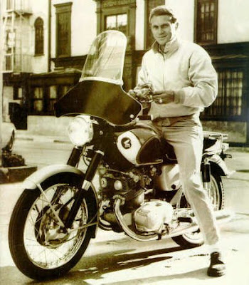
Being a dad and having a serious fear of winding up roadkill on the 405, I have never really embraced the whole idea of being on a motorcycle. That scene in the movie where Pee Wee Herman peels out on a Harley goes about 100 yards and smashes through a billboard comes to mind. Yet, somewhere in the back of my mind I do have a dark corner reserved for that reckless feeling of freedom and mind-numbing speed that only a motorcycle can deliver. It was great to work on the assignments and I gained a tremendous amount of insight into the various bikes and the people who ride them.
Honda is one of those dream brands that has a spot in American pop culture - hell, I had a cool long sleeved Honda motorcycle t-shirt in 7th grade and never even owned a bike.
Honda just needs the right nudge to be that lust-worthy brand it deserves to be. For one reason or another, the company that made the statement "You meet the nicest people on a Honda" and made motorcycles cool for everyone, somehow fell into a sea of sameness and receded into the background. Honda is a strong leader brand and has the power to be a Nike, Apple or Starbucks - if only they are willing to put it out there again.
If we get it, I really hope I get to work on it - and maybe even get a bike like an Interceptor or a Shadow...
Tuesday, April 28, 2009
Taxi Cafe
I work at a pretty great place. It's an ad agency filled with really hip, smart, people all devoted to a common purpose of creating brilliant work. It's pretty cool, but, not that cool. Why? because I just discovered an even cooler place. TAXI, an ad agency in Vancouver, BC. They have managed to combine two things together so naturally and beautiful that it hurts. Advertising and Coffee.
Behold, TAXI CAFE. Taxi decided that it would be a good idea to create a coffee shop in the entrance of the agency where clients or anyone looking for a great cup of coffee can stroll in and sit down. At the same time, Taxi is also displaying some pretty great branding that gets noticed (see above images) in a city over flowing with coffee shops. There is even a plan to open up an additional one across town away from the agency.
Wednesday, February 4, 2009
The Future of Advertising
Lately, I've been using Nike+ as a perfect example of where advertising as a medium may be headed.
Nike+ is a brilliant collaboration between two companies Apple and Nike, in which the end results transcend a mere product offering but rather a cultural shift in terms of what we as consumers expect from top brands and ways that the brand connects us to what is lust-worthy about that brand.
"In 2006, Nike and Apple teamed up to create a device that measures and records the distance and pace of a walk or run. The information is transmitted from a sensor located in the sole of your Nike running shoe and stored on your Apple iPod Nano. The kit is able to store information such as the elapsed time of the workout, the distance traveled, pace, or calories burned by the individual wearing the shoes, and display it on the screen or broadcast it through the headphones of an iPod. The receiver displays information comparable to that of the iPod kit on the built-in display. After a run, the receiver can be plugged straight into a USB port and the software will upload the run information automatically to the Nike+ website."
What are the results? A killer product that is supported by a well-thought out website. Nike+ taps directly into a collective that are fervently passionate about fitness and provides them something that can feed that passion.
"In addition to tracking personal workout statistics, the Nike+ integrates directly with the Nike website (created by R/GA). Workout data can be automatically uploaded to the website during an iPod sync with iTunes or through another program via the website's public API. The uploaded information is mostly not personally-identifying, but does also contain some personal statistics such as weight (if configured). Workout data is stored in XML files on the iPod, which has led some web and applications programmers to offer alternatives to the official Nike reports. On October 19, 2006, new features were added to the Nike+ website, including the ability to name runs. Forums were also added (which they refer to as "talk some trash"), allowing users to meet and challenge other runners, ask questions, and give feedback. Recently, there have been several more additions to the Nike+ website including but not limited to: a challenge gallery where all user created challenges are viewable, the ability to name the route taken when running or walking, compatibility with the new iPod Nano (fourth generation), a distance club to view everyone's total distance traveled, fastest 5K et cetera."
The positioning and messaging of both brands (Nike+Apple) are communicated seamlessly by providing an experience with tremendous benefits and then backing it up with a FREE website that allows the user additional opportunities to enjoy the product. Without a doubt, the best example to date of how a company can create a deep and lasting brand culture that is measurable and memorable.
Wednesday, January 28, 2009
Super Bowl XL111
The New York Times wrote an interesting article article regarding this year's Super Bowl logo and how the Super Bowl's identity reflects us as a nation, current graphic design trends and our intense passion for the game. Additionally, The New York Times created a slideshow of alternative marks created by various design firms to show a different look for this years game. Personally, I think it best to leave this type of logo development to the pros, although I can't say that I am that impressed with what Landor produced for this year's game. Dull, lifeless and pedestrian, the mark lacks any sense of excitement, depth or passion. Steven Heller said it best when he was quoted as saying “looks like the Bank of America logo.”
Tuesday, January 27, 2009
InFamous Wallpaper
One of the things I love about working at this place is that one day is never like the day before. Last week I was asked to help out on a bit of creative for a new Sony Playstation game called inFAMOUS. I had one day to come up with as many ideas and looks as possible and this is one of the things I had a chance to illustrate before the bell rang. It isn't very conceptual but, was well liked by the group and may live as a downloadable wallpaper...
Photog of the week _ Trevor Pearson
Once in a while you get to work with someone that you respect as a creative and admire as a person. Over the last couple of years I've had the good fortune of working with Trevor and consider him to one of the best. Whether it's shooting a new phone for Helio or getting a distinctive look down for Saturn, Trevor seems to have a solid understanding of what it takes to get a great shot off and at the same time have fun doing it. Take a look and if you really need something to look extraordinarily good, check out his site.
North Kingdom
A few years back I came across a site called Designchapel that contained some pretty amazing work by an individual named Robert Lindstrom. Every click of the mouse brought new and exciting imagery that showed a wide depth of talent and deep mastery of applications needed to create them. I continued to drop in periodically to see where this talented creative might land and in 2003 I discovered that he started his own company named North Kingdom.
Situated in the north of Sweden, North Kingdom has gone on to create and produce award winning work that has everybody talking. It is one of those shops that has yet to really defined itself completely and is actually a collective of many talented people who seem to stretch and pull Digital in any direction. The art direction is amazing and the experience seems to deliver results that delivers right on target. North Kingdom is just one great example of how much the role of digital has grown from being purely a storytelling device to more of an idea machine that binds the consumer closer to the brand through engaging experiences that really connect with the desired audience.
Goodbye Indie 103.1 FM
Unfortunately, one of my favorite radio stations INDY103.1 FM has fallen victim to corporate pressures and has decided to leave the FM airwaves rather than acquiesce to "The Man". Anyone who lives in the LA area and has a penchant for listening to an eclectic mix of music (The Clash, LCD Soundsystem, Air) played by DJ's with a soul knows about 103.1 FM and has been illuminated by it's brilliance. What a bold move in an age where people would rather switch than fight. It's RAW, it's PUNK and it's REAL. Check out the station online and also the nice logo mark created by our very local LA phenom creative Studio Number 1 Sheppard Fairey.
Tuesday, January 13, 2009
Pepsi vs. Coke
Due to slumping sales and lost marketshare, Pepsi recently introduced it’s first rebranding effort in over 14 years. The new work was created by New York design office Arnell Group and was a complete departure from it’s earlier look.
An Ad Age quote states: “PepsiCo today said it will pour some $1.2 billion over three years into a push that will include sweeping changes to its brands, including what Chairman-CEO Indra Nooyi characterized as a revamp of "every aspect of the brand proposition for our key [carbonated soft drink] brands. How they look, how they're packaged, how they will be merchandised on the shelves, and how they connect with consumers.”
The new Pepsi logo is suppose to depict a smile rather than a fluid swoosh and try to connect with a broader and hipper audience. Why Pepsi felt the need to abandon whatever equity it had established with it’s original look is a real mystery. The logo and new packaging seems a bit too “cool” and minimal and has been stripped of any sense of fun or excitement. It’s a soft drink – not motor oil or some bourgeois Canadian mineral water. Where’s the enticement and promise of a refreshing and tasty experience?
Interestingly enough, Coca Cola updated their packaging and came out with an entirely new look that embraced it’s heritage and strength in the category. The brilliant, bold and confident new package design (by TurnerDuckworth of San Francisco) emphasizes the well-established Coca Cola logo and makes a bold and striking avatar for the brand. Clean? Yes. Minimal and spare? Yes. But, we as a collective are well connected to the brand and all the flavor that needs to be translated visually is right there in the logo. One glance and you know the whole story; Coke is still number 1.
Subscribe to:
Posts (Atom)