Tuesday, November 15, 2011

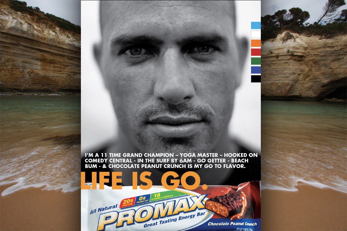
Promax print


Thought I'd finally throw up some creative the I did this past year for Promax Nutrition. A fun project with lots of moving parts.

Monday, November 14, 2011

Kofie One


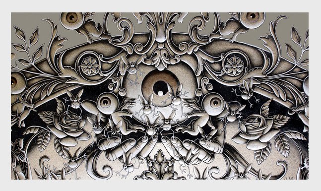
Quite taken by this very talented street artist Kofie One. His creative choices regarding color and graphic elements are quite nice. I'd like to acquire a piece very, very soon. You can see all the wonderfulness here.

Wednesday, November 9, 2011

Virgin America


San Francisco's very own Eleven has created a tasty micro site to persuade travelers to switch from their current airline to Virgin America. Entering your travel miles into a calculator provides you with a dynamic series of infographics highlighting among other things; the various hours you've wasted, pretzels you've choked down, type of mystery stains you've sat on and seconds of WiFi you could have enjoyed.

The site also will help you craft a "Dear John" letter to help you break up with your current airline and a "Twin tested" page that showcases 3 sets of twins and their experience of having one twin travel Virgin and another traveling a competitor. The design and concept is really well done and actually a clever way to promote the tone and voice of Virgin, the brand. Two thumbs up!

Saturday, November 5, 2011

Hero Series No 1. John Jay


I have been a huge fan of John Jay, Wieden and Kennedy's, Executive Creative Director for quite some time. A designer, taste-maker, visionary, incubator, instigator and mentor - with a supernatural instinct for creating beauty and what lies just beyond the public's perception of Now.


A few decades ago, John was working in New York as Bloomingdale's creative director and was tapped by Dan Wieden to bring his eye for elegance and grace to campaigns they were working on for Nike. Dan's idea of bringing in someone outside of the advertising industry to creatively drive Nike's visual language was nothing short brilliance. John's passion and drive was evident from the start and he has been inspiring and informing W+K's creativity culture internally and externally ever since.


Taking his vision and experience globally, he expanded W+K into Tokyo in 1998 and Shanghai in 2003. The Tokyo studio, W+K Tokyo Labs, in particular, has become a hotbed of experimentation and has been a key factor in spreading the hip-hop aesthetic into Asia. He now divides his time between those two offices and his base in Portland, where he plays a quiet role in the emergence of the city's exciting arts, design and music scenes.

Recently he was names as one of Fast Company's Top 100 Most Creative People in Business 2011. A video of his creative philosophy can be seen here.

Wednesday, November 2, 2011


I recently came across The Donut Project's "Good Fucking Design Advice" website which actually brought a smile to my face and is actually quite accurate in terms of stating (boldly) what it takes to be a good (fucking) designer. One can absorb such profane pearls such as "A computer is a Lite-Brite for bad fucking ideas", "Find fucking inspiration everywhere" and the always brilliant "Stay up all fucking night". If you are so inclined, you can even pick up a poster suitable for framing.

As an instructor, I have often repeated these design rules over and over again (on rare occasions eliminating the profanity) but, for my money the best design advice would have to be Bruce Mau's Manifesto which can be viewed here. Know it. Learn it. Live it, Baby.

Sunday, October 23, 2011

Eat Big Fish


Last year I had the pleasure to work with Mark Bardon while working at Eleven Inc on a creative initiative for Rosemount Wines. Mark is one of the brilliant partners at a strategy agency called Eat Big Fish and their whole mission is to promote Challenger thinking and behavior to give companies a creative edge. EBF will consult with you and your company to craft strategy and a action plan to make it all come together - or you can dial up on of their workshops and work it internally. I really enjoyed the experience and got a first hand opportunity to see EBF in action.

More than ever, clients are demanding a clear pathway to higher ground and looking for a solid strategic game plan that has teeth and a brain. EBF's site contains lot's of great thinking and case studies and even has an iphone app for inspiration on the go.

Monday, October 17, 2011

F Bombs Away!


So, this is how the F Bomb wine label with the Tavis Coburn goodness illustration turned out. Quite pleased with the results and hope that it's a big hit on the shelves.

Tuesday, October 11, 2011

Love Gun


Tonight's little project is refining a Napa Valley sparkling wine label titled "Love Gun". A fun execution that takes the fight to the shelf with a dramatic black and white execution.

Monday, September 26, 2011

Love Typography Study


Couldn't sleep last night, so this is the result. Part one of a little type execution simply called "Love". I'm thinking of doing a poster series based on this type of exploration. Hm.

Wednesday, September 21, 2011

Chicago Marathon 2011 Poster


I have a brother in Chicago who is insane enough to pull this run off annually and someday I would love to accompany him on the exercise in pain management.

This year artist and art director, Brandon Knowlden, has created a series of posters to give to whomever donates to the American Liver Foundation. Knowlden is actually giving something to those willing to sponsor his race, and those who donate will get their choice of one of three pretty awesome personalized prints representing training for the marathon, running the marathon and finishing the marathon. Knowlden’s training sessions are broken into short, medium and long runs, and interested parties will sponsor $30, $40 and $50 for these runs respectively, with all proceeds going to the American Liver Foundation. Each print will come with the sponsor’s name and the distance and the average speed Knowlden ran. The posters are actually pretty cool and it's a clever way to really get the donations boosted. If interested, donate to Knowlden’s run here.

Tuesday, September 20, 2011

The Lullaby


Love this video of Joe Fenton creating brilliance called "The Lullaby" on Vimeo. Check it.

Monday, September 19, 2011

Mission Critical


Here is a little typography project that I have secretly been working on. I could tell you more, but then I'd have to kill you...

Baubauhaus


Just came across this cool design inspiration blog, Baubauhaus, curated by two guys from Romania, Stefan Lucut & Andrei Don who put a little different spin on what's thrown up there. A nice selection of photos, typographic executions, posters, illustrations and the like. Hours of viewing pleasure!

Friday, September 9, 2011

MovingBrands


A branding agency that I have loved for a while, MovingBrands hails from the UK and in my book, "get's it". They have a fresh and forward angle on branding and the work reflects their deep appreciation for strategy and positioning. Each case study starts with a tasty set of sketches and brainstorming sessions, drawing you into the process and showcasing the engineering that goes into the creation of an identity. In a world that seems increasingly resistant to high design and just goes straight for functionality (i.e. Facebook, Google, Seattle's Best Coffee...) , MB fights back with dynamic, inventive, sophisticated, smart work. Well done, mates. Well done.

Tuesday, August 23, 2011

Leah Giberson


As summer winds down, I can't help but be whimsically drawn to the artistic visual splendor created by Leah Giberson. Her work is bright, colorful and beautifully crafted as it transports you to some quite moment that makes you feel as if you are the last one at the beach. infinitely more optimistic than Edward Hopper and leaning closer to Thiebaud. Prints of Leah's paintings can be had for a song at Etsy.


Monday, August 22, 2011


Nice work from across the pond by designer/art director Patrick Fry. He has a great feel for clean, evocative design and really handles type well. I also enjoy the fact that his work seems to be able to traverse a wide distance yet, always in his roundhouse of aesthetics. Patrick's tasty identity work is also very telling with regards to his illustrative talents. One thing that I've also noticed with a lot of leading designers is that they are not afraid to create a tasty Zine to showcase the work. It's nice idea when executed well.

Monday, August 15, 2011

Diet Cokeness!


Coca Cola recently turned to SF's Turner Duckworth for a Diet Coke package refresh that solidly delivers a punch on the grocery shelf as well as on the chin of it's competitor's. Earlier in the year, DC became America's leading soft drink and this package communicates the brand's confidence and position as the logo is wrapped around the can and only gives you a partial glimpse of the brand's name. While Pepsi continue's to slide after last years Arnell Group debacle, Coke continue's to embrace it's visual heritage and cultural position with attitude.

Friday, June 17, 2011

Cafe Zoetrope


Recently I was riding on a Muni bus marveling at the incredible beauty that lives in every corner of San Francisco and I was thinking that I should have a nice point and shoot camera like a Leica M8 (sliver please) to capture these visual opportunities as they present themselves every 5 seconds in SF. I don't have a Leica, but I do have an iPhone4 and I took a picture of Cafe Zoetrope as we paused for 5 seconds at a stoplight. The interior lights of the bus created these great diagonals that made the shot so graphically interesting. No special effects or Photoshop. Just Apple.

Tuesday, June 14, 2011

Getting Ugly


Just a few preliminary looks at a Coyote Ugly whiskey label I have currently underway. Fun brand so, it should be a fairly edgy, fun label. Cheers

Friday, June 3, 2011


Once in a great while, you see something that actually kicks your heart into high gear and you get excited about what you do and why you do it - it's like falling in love all over again and I really love this.

At a time when we have an entire generation of brilliant, creative, intelligent post graduates sleeping in their parents basement because of a dismal job market and lack of opportunities, comes a group of young upstarts with a fresh idea. Freakers.

What is Freakers? It's basically a new approach to to a beer cozy and they are raising money on Kickstarter to get the whole thing rolling. Is this something that needed to be rethought? Is this a product I really need? Can't tell you and I don't care. All I know is that this is something that is cleverly promoted by a group in North Carolina and with their kooky ex-coffee barista pitchman, Zack (think of a scruffy Willy Wonka on a Jolt cola and Vente latte high...) delivers with an irreverence that perfectly matches the product and the desired demographic they are speaking to. It's all there.

Was the birth of this the result of some large agency on Madison avenue and a giant bag of money? No, this was simply a creative collective that wanted to start something unique, different and not expected. By utilizing everything within reach: humor, music, great design, a hard work ethic, a "give back" cause mentality, beautifully shot videos, charisma, social networking and a little bit of voodoo, they are creating a tribal following to a product that has yet to even hit the market. If these guys can make a sock with the end cut off desirable and cool, it makes one ponder with regards to what would happen if other companies started telling stories that actually made you pay attention and care. Old Navy? VW? Sony Playstation? Coke? Travelocity? Farmers Insurance? The results are fantastic and I wish them the best of luck.